Complexity for Simplicity
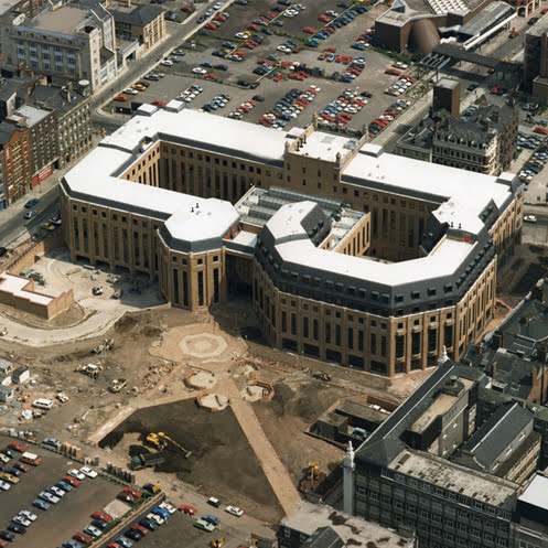
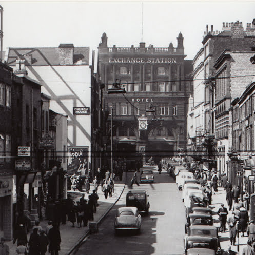
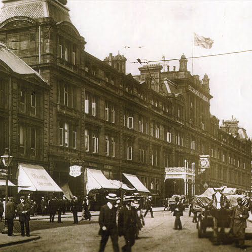
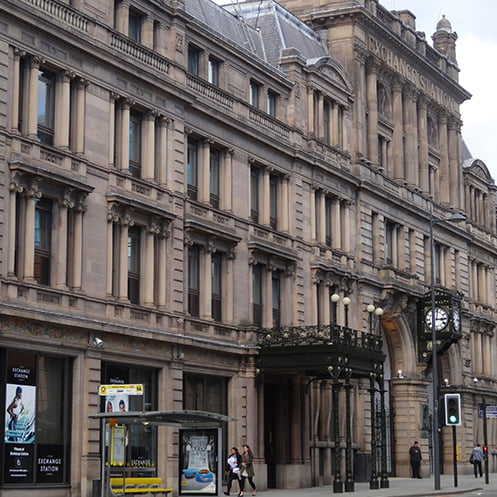
Originally opened by Princess Anne in the mid-1980s, Exchange Station was once a symbol of modernity – an architectural statement with robust floor plates, coffered ceilings, and generous floor-to-ceiling heights. It was the first building in the UK designed with ‘computer floors’ (raised access flooring), however, over time, its rigid structure began to show its age. The central shopping centre, once a vibrant retail destination, became a liability. The building needed reimagining both spatially and operationally to meet the demands of a digital, agile world.
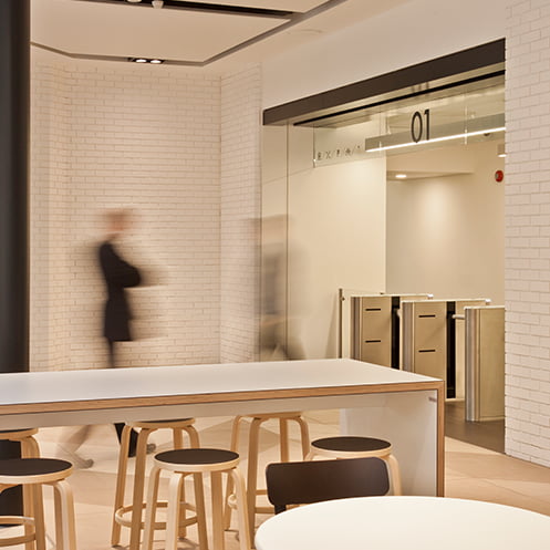
The challenge was to transform a tired scheme into a future-proofed, fully flexible workplace serving 200,000ft² of office space. The solution was to reorient the building inwards, turning the redundant shopping centre into a shared arrival space; a central concourse that would become the heart of the building’s new identity and sense of place.
Technically, this was a complex project. The building was split into distinct ‘houses,’ each with its own entrance and postcode. The fire strategy became the key to unlocking the building, closing off existing entrances as final exits, and extending stair and lift cores to rationalise circulation. The objective: seamless access to all corners of the building from a central amenity space, where the shopping centre once stood.
Sector | Workplace
Completion | 2013
Client | Aviva Investors
Awards | BCO (British Council for Offices, Best Workplace Fitout
Manchester Society of Architects Award
Copyright | Courtesy of BDP


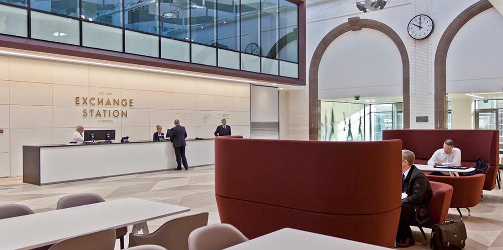


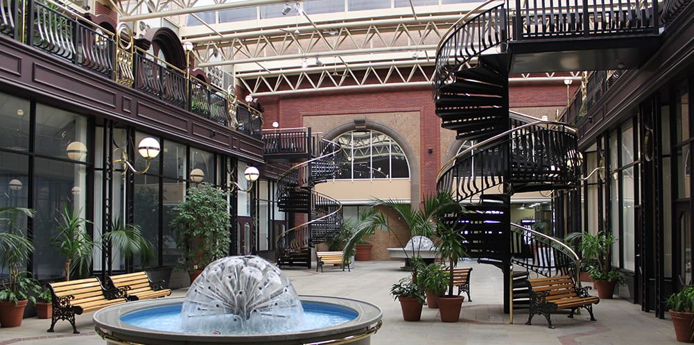
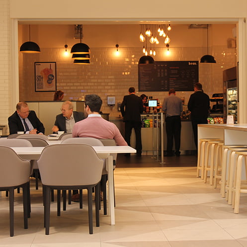
Around this new heart, additional floor area was introduced as small, flexible office suites designed for agile, start-up businesses. This infusion of fresh enterprise brought vibrancy back to the building. Shared meeting rooms, available at low cost, reduced the need for private provision within offices and encouraged collaboration across tenant groups. A central coffee shop provided a social anchor, while a variety of informal breakout spaces and touchdown benches activated the concourse throughout the day.
Designed as a truly flexible third space, the concourse could become a venue for events, celebrations, sporting occasions, and business gatherings – forming a genuine business community under one roof.
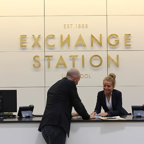
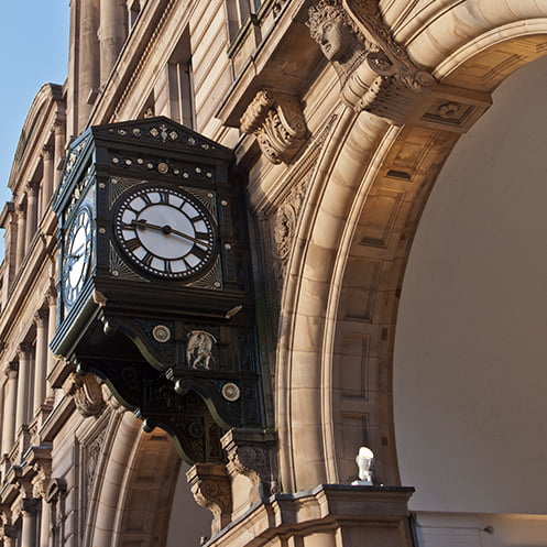
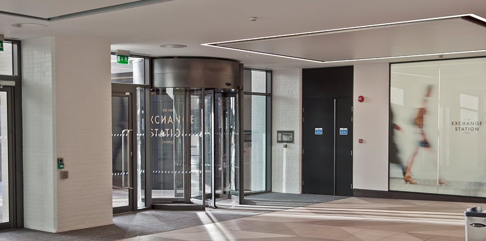
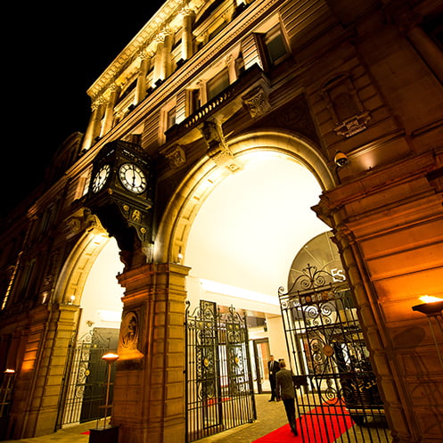
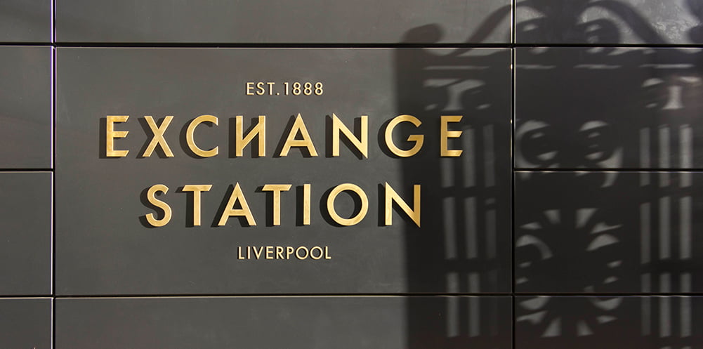
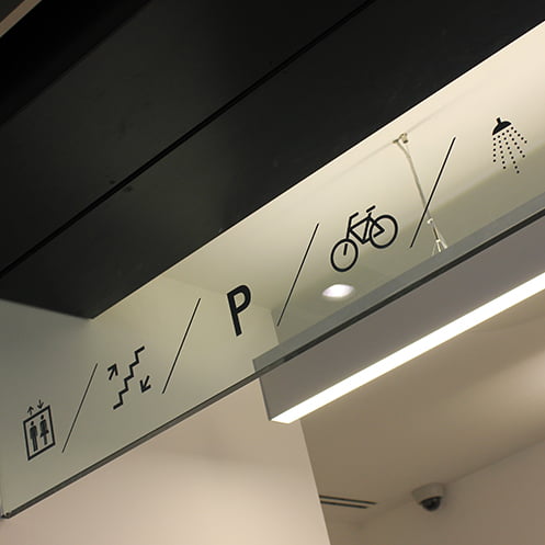
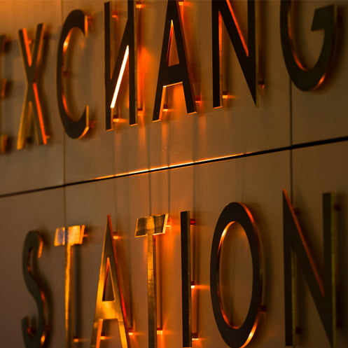
The building’s original name, Exchange Station, was reinstated, replacing Mercury Court and honouring its heritage as a former railway station and place of transit, but now a place of exchanging ideas, knowledge, and creativity. The brand identity took cues from this heritage: a chamfered typeface inspired by London Underground signage, a bespoke station clock echoing Swiss railway design, and a graphic language of travel-style icons and pictograms to reinforce a sense of movement and connection.
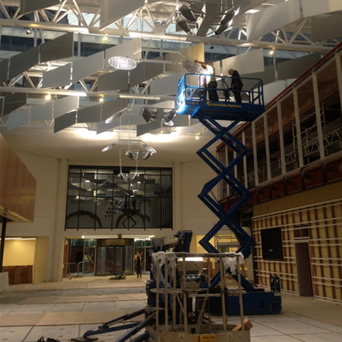
Chamfered architectural geometry became a recurring motif, expressed through acoustic sun-shading baffles, enabling patterns of light and shadow across the concourse floor. The baffles were essential to mitigate glare from the east-west orientation, ensuring the central space remained comfortable and usable for digital work. Their chamfered forms, subtly echoing the waves of the nearby River Mersey, helped create a calm, comfortable environment for work.
The culmination of these interventions was a singular, unified identity stitching together architecture, materials, graphics, and spatial experience into a cohesive whole to support new ways of working. Every element honoured the building’s past while projecting a confident, progressive image for its future.
The final act of restoration was the grand external clock, repainted in its original dark green livery, and a Union Jack flag once again proudly flying high above Tithebarn Street. A deliberate act of respect: dressing the building for business, reinstating a sense of pride, ceremony, and intent.
Exchange Station is once again a vibrant, thriving workplace. A place where good business is celebrated, and work is honoured.


Behind the Scenes